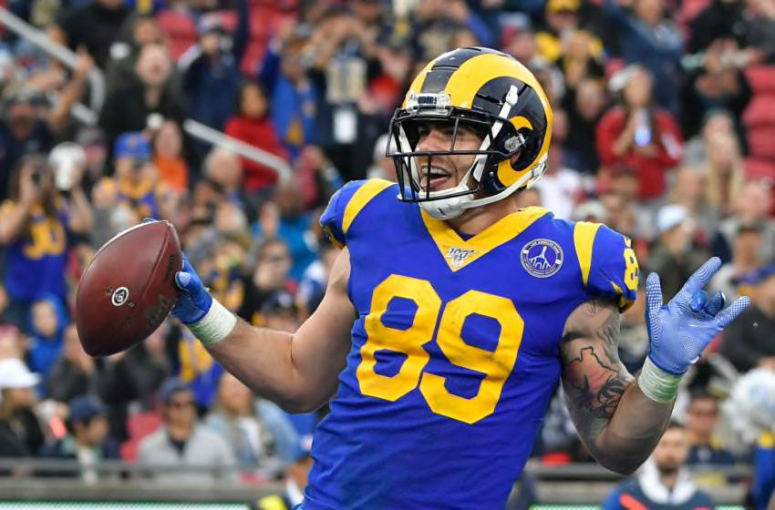
Tyler Higbee, Los Angeles Rams. (Photo by John McCoy/Getty Images)
The Los Angeles Rams revealed their new logos, colors and wordmark on Monday afternoon. The response to the primary logo hasn’t been kind.
People don’t like change. This goes for their sports teams as well.
On Monday, the Los Angeles Rams released their long-teased new logo. It wasn’t received kindly.
The wordmark is pretty cool, and the colors harken back to the team’s glory days in the 1980s before the move to St. Louis. The secondary logo of the ram’s head is also pretty sweet, a nod to the franchise’s earlier times in the 1950s (and specifically 1951, when it won its only title in Los Angeles).
However, the primary logo looks like something you’d get in a generic video game that didn’t pay for licensing rights. Of course, it’s the most important part of the reveal, and both fans and media alike are not having it.
In truth, new logos and uniforms almost always take criticism. People need to warm up to the look before embracing it, and that could be what’s happening here.
However, the Rams made a very simple decision complicated. The team has a long, storied history with the city and could have simply went back to an older look (blue/yellow or white/blue) and rolled from there.
Instead, they tried to modernize the whole thing and ended up with a bland look in the most un-bland of cities.
The Rams still have to unveil their new uniforms, but there’s work to be done before people hop on board.